To mark my 50th post on this blog, it’s time for a small facelift! Time to switch up the header image into something a bit more colourful!
One of the key ingredients to getting a decent picture, is proper composition i.e. how to best frame the shot. When I started reading my first photography book, the first chapter was all dedicated to explaining some basic principles one generally has to follow to properly compose a photograph. I’ve read about the rule of thirds, leading lines, foreground interest etc, but for some reason my favourite one is patterns. Can’t explain it really – but somehow the ability to capture patterns either natural or man-made, always brings a natural rhythm and harmony to photographs.
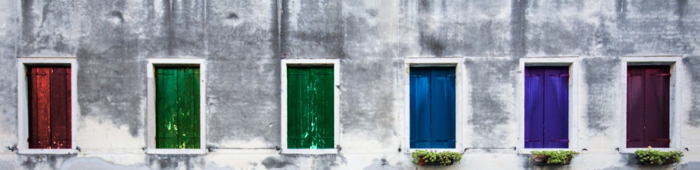
This is a picture I took on my recent trip to Venice. Admittedly though, I got in and tampered with it a bit in Photoshop, as the original one captured had all windows in a uniform deep green colour. There was nothing wrong really with the original picture, but since I wanted something cheerful to uplift the face of my blog page, I thought appropriate to add some colour in post production.

Taken with my Canon 60D and Sigma 10-20mm F4-5.6 DC HSM lens, at ISO 100, F8.0, exposed at 1/60th of a second. Processed in Photoshop CS6.
